
1

Paula is an incredibly hard-working, detail-oriented, and talented designer. She led a major design initiative at the East End Food Co-op to recreate our logo and refresh our brand (…) We are grateful for her support and I would be happy to recommend her to any other organization looking for a professional graphic designer.
Graham Anderson,
President at East End Food Co-op
__________
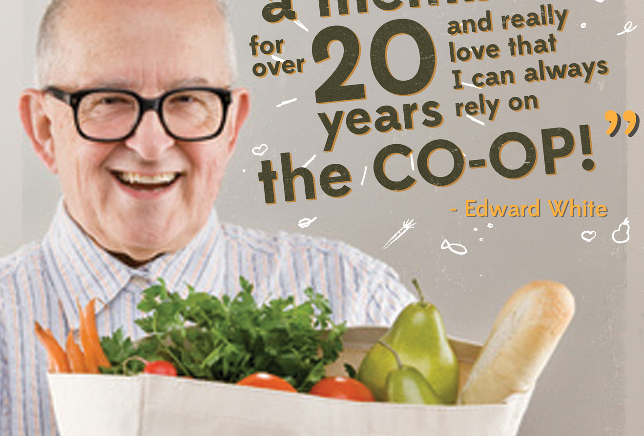
The East End Food Co-op is a retail food store on Commercial Drive that is cooperatively owned by 10,000 shopper-members.
The Goal
When the East End Food Co-op contacted me, they were soon approaching their 40th anniversary. To mark this milestone, they wanted to revamp all of their brand materials starting with their logo. At that time, they used a range of fonts and logos which made their brand appear inconsistent and ill-defined. This was an all-encompassing project, which spanned over the several months and not only required the design of new logo, but also the creation of several brand collaterals such as a sandwich board, shopping bag, store awning, in-store signage, packaging labels, poster campaign and online newsletter template to name a few. The goal was to build a solid logo and brand experience which conveyed clearly their core identity values: community-owned, healthy and local.
The Strategy
The East End Food Co-op is located in the heart of the vibrant and eclectic Commercial Drive neighbourhood, and so are most of its members. To convey the colourful spirit of this community, I opted for a logo design that was cheerful with its pleasing curves and warm colours. The uneven shapes found in the logo elements are there to convey the diverse medley of people that happily share this community. They also serve to visually communicate a sense of ''made-by-hand'' products, which is in line with the idea that the Co-op values and highly promote healthy foods are often handmade, locally grown and require the least amount of processing.